To quickly build digital products with effective UX designs, software engineering leaders must leverage design systems that promote reuse and assembly.
- Gartner client? Log in for personalised search results.
Software Engineers Need Design Systems to Build Products With Good UX
July 30, 2021
Contributor: Ashutosh Gupta
Many modern-day product teams continue to create original UX designs and craft digital experiences from scratch. In doing so, they overlook the advantages of using existing and proven design patterns leading to poor usability, visual and behavioural inconsistencies, as well as longer design cycles. To improve the overall UX quality, software engineering leaders should deploy a design system—a set of reusable design assets and presentation layer code components that are governed by clear standards to build various digital products.
“A design system is one of the most important strategic assets for your company. It is a living digital product that requires a team, a plan and a set of specialised tools,” says Brent Stewart, Senior Director Analyst, Gartner.
Download now: Improve Software Quality by Building Digital Immunity
What value does a design system add?
A design system creates a “single version of the truth”—a central design language for UX designers, enabling them to craft consistent user experiences across diverse teams, channels and platforms. The value proposition of a design system includes:
- Speed: It significantly reduces the design and coding time by leveraging the tried and tested UX design patterns instead of creating everything from scratch.
- Scale: It allows designers and developers to share common, approved design assets and code components across an entire portfolio of digital products.
- Brand compliance: It ensures that each design asset aligns with an organisation’s brand attributes like colour, logo, typography, voice, tone, etc.
- Reduction of defects: Over time, a design system’s code components become “hardened,” making production defects a rarity in the presentation layer.
What does a design system constitute?
An ideal design system comprises design tokens, customisable UX design patterns, production-ready codes and instructions to efficiently deliver high-performing digital products. Here are the four components of a design system:
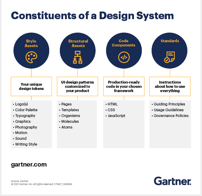
Style assets
The visual, written and behavioural attributes like logos, colour palette, iconography, typography, voice or tone come under the umbrella of style assets.
Advanced design systems use design tokens to centralise the management of colours, text styles, icons and more. Design tokens are platform-neutral entities that store design variables and are used in place of hard-coded values such as pixel or hex values to maintain UI and UX consistency when design systems scale.
Structural assets
Structural assets are an assembly of UX design elements (specific buttons, page templates, etc.) for creating user-friendly screen designs with a shorter turnaround time.
The atomic design approach is one of the most popular ways to describe the hierarchy of structural assets. Here is a general breakdown:
- Atoms: An atom is the foundational unit of a user interface. A single form field, a drop-down menu, a button or an icon are all atoms.
- Molecules: A molecule is a small group of UI elements that function together as a unit—a cluster of several atoms. A collection of form fields or an associated submit button can be an excellent example of a molecule.
- Organisms: An organism is a more complex entity in the UX design hierarchy– an aggregation of molecules and atoms. Examples of organisms include utility navigation, global navigation, hero space and the footer.
- Templates: A template is a reusable framework or design layout formed by aggregating atoms, molecules and organisms. Standard templates include the homepage, product list page, product detail page and shopping cart.
- Pages: A page is a fully developed and optimised version of a template. When a template is enriched with placeholders or real content such as text, images or advertising units, it becomes a page.
Code components
Code components are an inventory of production-ready codes in the selected framework. They are organised using the atomic design approach hierarchy. Each design atom, molecule, organism and template have an associated code component to match. Sophisticated design systems tokenise code components for updating colours, typography, spacing, etc., in a centralised manner.
Standards
Enforceable guiding principles, usage guidelines and governance policies should be in place to create efficient design systems.
The guiding principles ensure that design assets and code components are modular, composable, generic, flexible and accessible. Usage guidelines include the rules related to typography, colour palette, dimensions and spacing, grammar, aspect ratios, writing style, etc.
Governance policies are necessary to sustain the given standards over time. Instead of implementing the conventional IT governance model, software engineering leaders can use a wiki-style approach. It can give contributors the freedom to create, update and delete style assets, structural assets and code components on an ad hoc basis, allowing the product teams to improve the design system “on the fly.”
To maintain the credibility of the design system, the leadership team can review additions, edits and deletions during a significant release, apart from their quarterly reviews.
Utilise existing UX design systems
Over the years, various platform-based and open-source design systems have been launched to ensure high-performing UX. For building apps on a major platform, it is highly recommended to re-purpose these existing design systems as much as possible. The design assets and code components in these systems are backed by extensive research on UX within product categories such as customer relationship management (CRM) and enterprise resource planning (ERP).
Allocate a team for design systems
Treat your design system as a digital product by establishing a product leadership consisting of a product owner, UX lead and development lead.
The three leads can improve the design system with operational, design and technical guidance. The team can also have contributors such as UX designers, content strategists, front-end developers and accessibility specialists to handle each release of the design system.
You may also be interested in